
marissa kress
printmaking
Spring of 2016, when I transferred to IUS I was just too excited to start printmaking. Usually, you start this class like your junior year, but I just wanted to do it now. And I am glad I did. I enjoyed the class so much! Honestly didn't know printmaking was a thing today. It was a wonderful new experience for me.
Surreal
Monotype
2016
We got to create a monotype using cyan, magenta, yellow and black. Like every other project, I did not know what to do, but I think I was showing some of the students in my class my Ivy Tech work and that is when it hit me. I did a piece at Ivy Tech for a surrealism project. All the colors in the photo would overlap and create green, orange, purple, and black. I printed out my photo and taped it to the back of the plexiglass. We started with the lightest layer, yellow. I used erasing tools like q-tips, a flat toothpick, and a shirt. I erased everything that did not need yellow and kept the yellow for yellow and orange. I applied this technique to the magenta layer. The magenta over the yellow made the orange and left plain magenta for purples. Once again, applied this to the cyan layer. The cyan with magenta made purple and yellow made green. I did not use black in this project because I was proud of the CMY layers. I did keep yellow and magenta out in the snow area for dept. This project used a lot of CMYK color theory. Every layer I had to think about what I needed to mix with to make a color or if I just needed to erase it.


Historic Fort Wayne Embassy Theater
Intaglio - Copper Plate
Phase 1 & 2
2016
This project was about finding something to make into two phases or versions. For example, a hand drawing of a house then the next phase would be the actual house. I don't remember how I got to this idea but, growing up with music, I wanted to do a line drawing of a flute and one of my favorite places I have performed. I played flute and piccolo in high school and was given the opportunity to join the IMEA (Indiana Music Education Association) 2014 Honor Band. The performance was at the Historic Fort Wayne Embassy Theater in Fort Wayne, Indiana. I spent a weekend in Fort Wayne with talented musicians and a beautiful Director.

Phase 1:
I started with a copper plate and cleaned it off, added contact paper on the back, beveled the edges, and rolled on Hard Ground to the top of the plate. I found a nice photo of a professional flute like mine, printed and poured a little baby powdered, and rubbed around it on the back of the photo. This technique will use a pencil to trace the lines and color changes of the photo and transfer the powder to the plate. After tracing, I used a needle tool and scratched all the lines. Next was a Ferric Chloride acid bath. This acid eats, or etches, at copper and will only eat any exposed copper, like the lines I just scratched in. The Hard Ground is a resistant. The longer the copper is in the acid, the deeper the lines will be. Deeper lines hold more ink and make lines darker on the print. Any lines you want lighter will be in the acid bath for a few moments. If you need darker areas too but don't want those shallow lines to get deeper, Asphaltum is a resistant you paint onto your plate. I used the Intaglio technique to print this piece.
Phase 2:
Before starting the second part of this project, we had to sand down our first phase so it wouldn't be so prominent when printing the second phase.
The second half had to incorporate texture of some sort. I wasn't sure how texture could go a smooth flute or something with a band that has texture. I got to thinking about favorite memories I had in band. In my senior year, three seniors got to join the IMEA Honor Band and I was one of them. I remember this theater having such an ornate ceiling...which could translate to texture for phase 2! I rolled on Soft Ground onto my copper plate. As my plate was cooling, I found an image online of the theater we performed in and blew it up to the size of the copper plate we had. I used baby power again to outline the theater. Our teacher had a bin of fabrics we could use for texture and found a few that could mimic the ornate ceiling and curtains. I had to cut pieces to fit the shapes of the ceiling, walls, and curtains. I placed them approximately where they would be and rolled the plate with the fabric through the press. Some of the soft ground came up from where the fabric textures were, crazy! I then etched in with my needle the large shapes on the ceiling, seats, and the piano on stage. I went through the Intaglio process a few times to find a perfect print.
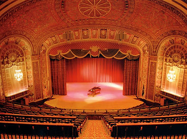
image from livingfortwayne.com
 |  |  |
|---|

Mother
Black & White Monotype with Screen Print
2016
This was our final project and we got to chose what technique we wanted to use for this last project. I really enjoyed doing a monotype but didn't have a subject in mind. I was looking through social media photos and came a crossed my mom. I clicked on her page and looked through photos of her and this one really popped out to me. Her high school senior prom photo. The reason I chose my mom for this project was that in the past year we got really close because of family situations...and just wanted to appreciate my mom differently. Not only did we get to use our favorite technique, but our teacher gave us a list of artists, and had to pick out one that we connected with the most. I don't remember my artist's name, but her work was black & white with white text over the top. the photo was of a child and the text has names and ages. I didn't look into the works backgrounds. But if I used my mother as the subject I could use words or phrases that describe my mom.
I used larger plexiglass for this project because I've always wanted to do something big. I measured where my paper would go and the size of the paper so I could print out a copy of my mom. I printed three pieces of paper to overlap and fit the dimensions and taped them to the plexiglass. To use my artist's style of black & white and to be a monotype, I made my black ink very transparent so I would build layers of shadows. I then made a second batch of transparent black but less transparent to use for the hair, flowers, and ankles. I began with a full layer of the lighter transparent black then ran it through the press. The second and third layers were hard to do because I had to guess how much ink to wipe off the glass. I wiped away ink with rags, q-tips, and toothpicks. As I progressed through 5 five to six layers, I rolled on the darker transparent ink around the hair and face, flowers and ankles, and shoes. I had about two layers of dark ink. after seven to eight layers and five hours later, mom was done. I made three prints and only one had just a perfect registration. To be honest, I teared up a little too...but I wasn't done yet. I had to add the text.
To involve the artist's use of text over the image, I ask my mother a series of questions and her answers would be my words I use over her images. Being in the "Intro to Printmaking" class, it isn't really recommended to use screen printing, but if I wanted sharp text on my print, that was my option. I laid out an Ai file of the size of my paper and typed out all the answers. I then printed out the text on laminate paper then began the screen printing process. I don't remember a whole lot about the screen printing process because the instructor did most of the work. After all, we were in an intro class. But in the end, I used the biggest screen our school has and began to print with gray ink I had made myself.
 |  |  |
|---|